Too often I see Wix or Squarespace sites taking 10-20 seconds to load.
Why spend time and money on a website when half your visitors don’t make it to the home page?
Let’s create a website that:
Loads in under 3 seconds
Works on mobile
No funny gaps or broken buttons.
Reflects your personality
Let your personality shine through with every design decision. No more generic templates!
You control
If Wix goes under, your website goes with it. If Squarespace hikes the price up, are you really going to rebuild elsewhere? With a WordPress website you own everything and have full control.
You can afford
For a local business on the high street, websites like mine cost over £1000 (seriously).
As a fellow creative, I understand that we don't have that kind of money lying about. But we still deserve to represent ourselves professionally online. Get in touch below for a no-pressure consultation on whether you need a website, and my process for building one with you.
Your website represents you online for years, sometimes decades.
Let’s make it slick, fast, and full of personality.


Recent projects
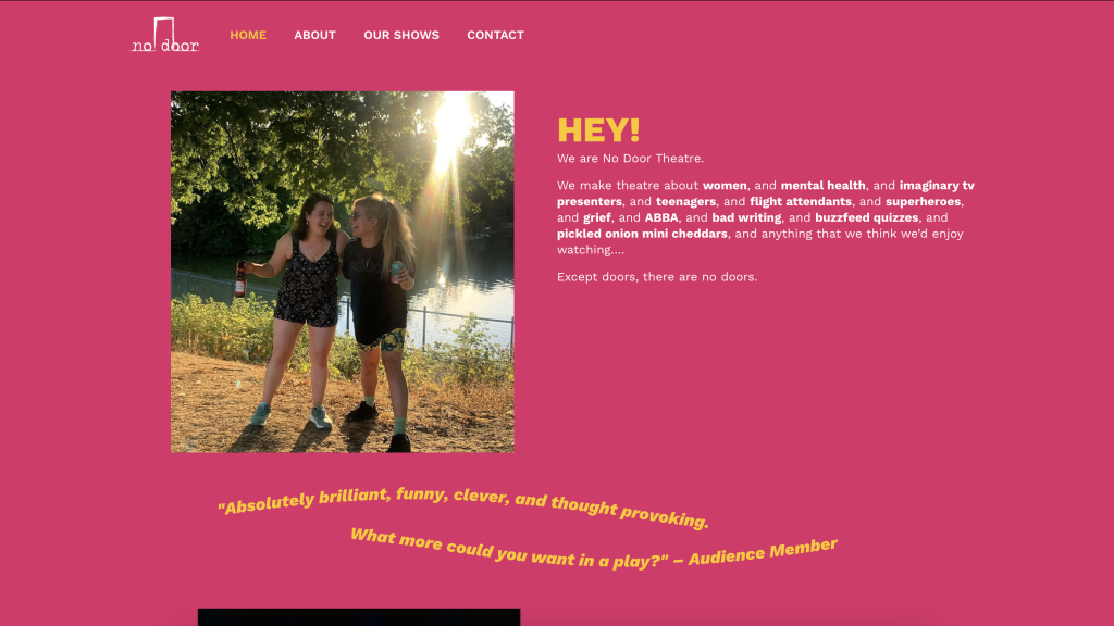
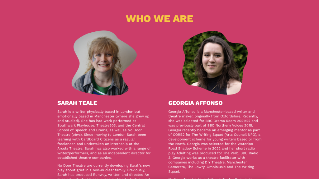
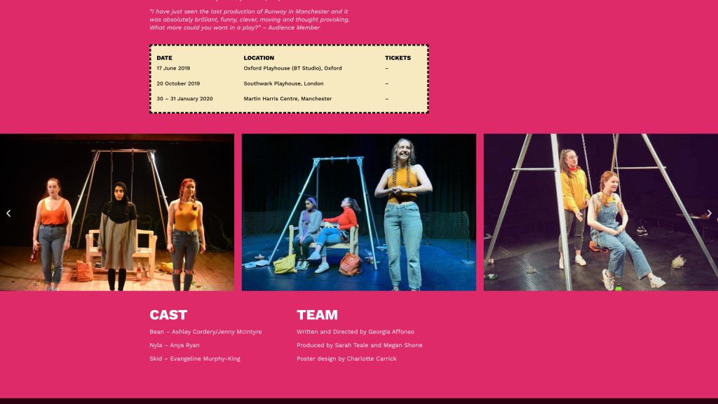
No Door Theatre wanted something fun and bold, but professional. That meant bold type, clashy colour scheme, and sparkly buttons – but the consistent design language and even layout meant the website didn’t compromise on looking professional.
The other key area was flexibility with event pages that could adapt to events at different scales and stages. To solve this, pretty much every section of an event was optional and would disappear if nothing was entered on the backend. Even the ticketing banner changed shape and location based on whether the event was a one-off or a tour.


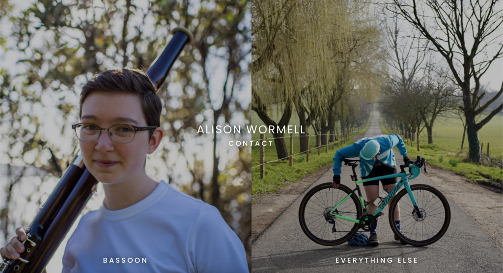
What does the bassoon have to do with cycling? More than you might expect!
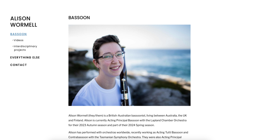
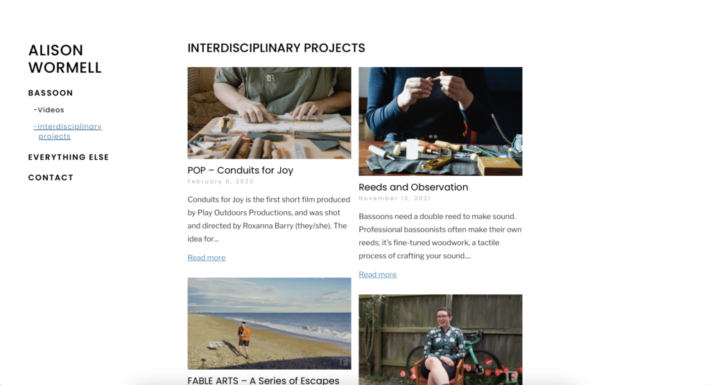
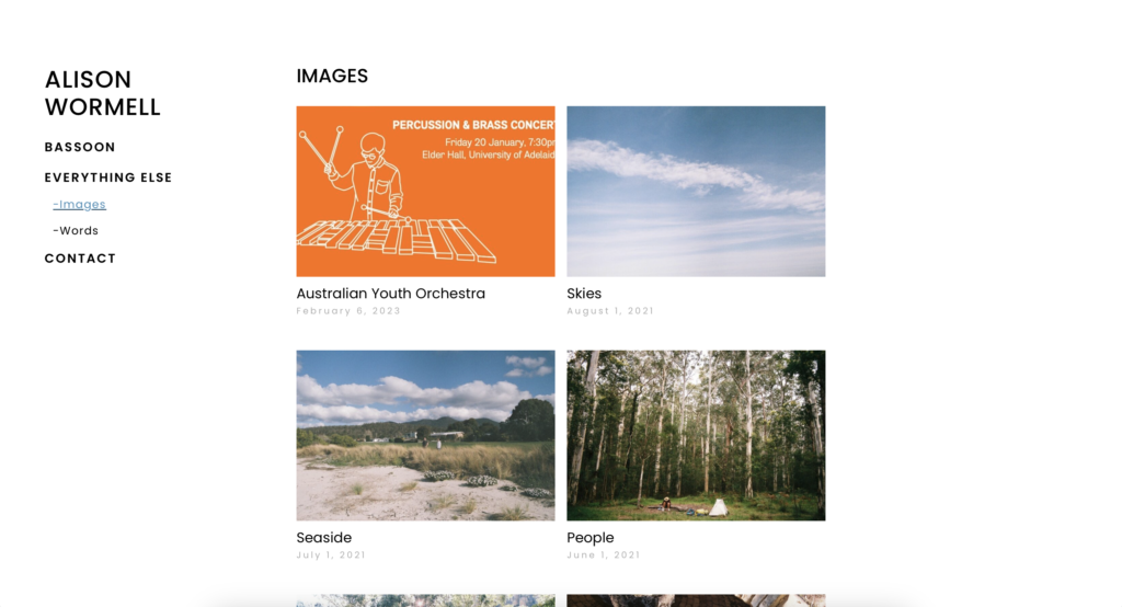
If you think your portfolio skills are too diverse to condense into one website then I consider that challenge accepted! The site divides into two from the offset, speaking both to bassoon-bookers on the one hand while also making space for Alison to express themself with essays and photography.
A minimalist layout makes space for Alison’s beautiful photography.
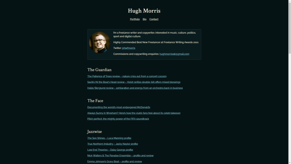
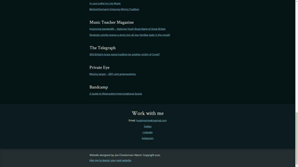
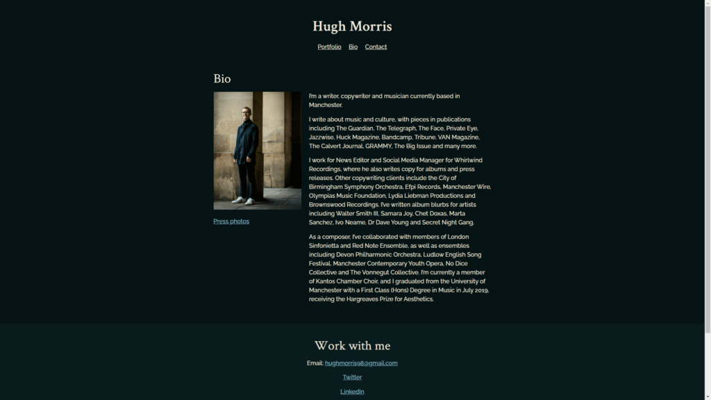
As Hugh’s career has developed, so has his website. Once a portfolio musician working as a composer, writer and performer, Hugh now focuses his efforts on writing.
The new site puts Hugh’s writing front and centre with a portfolio straight on the homepage, alongside a short bio and a ‘work with me’ footer on every page to maximise the chance of someone making contact.
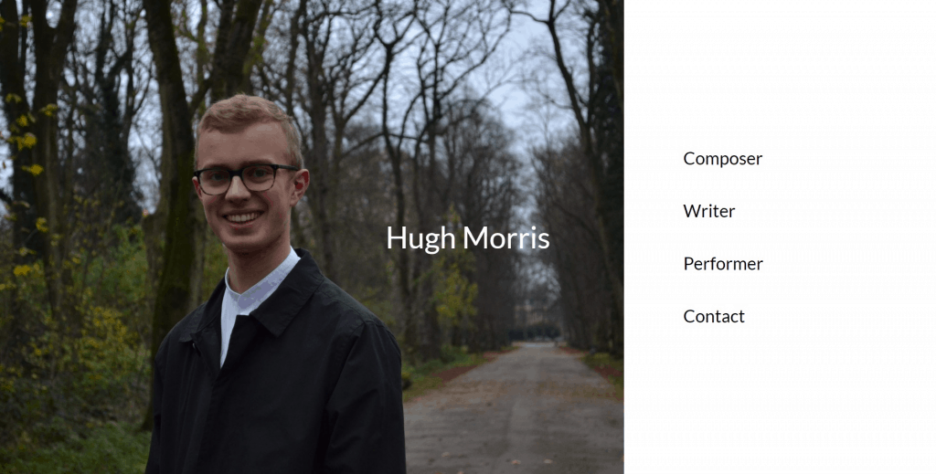
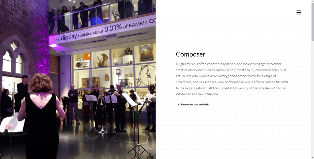
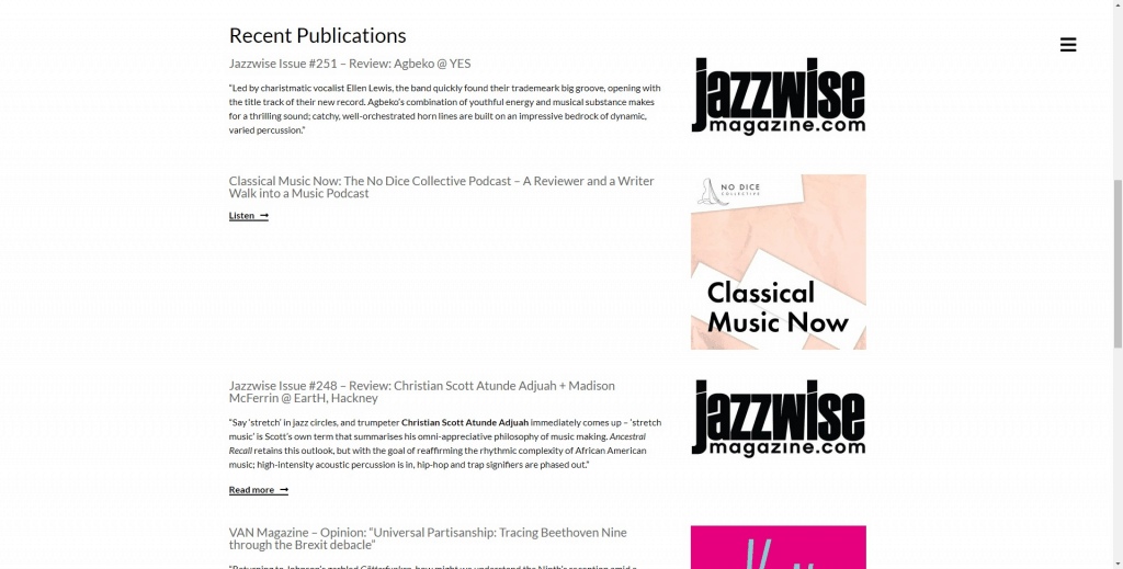
See Hugh’s old website design listed below.
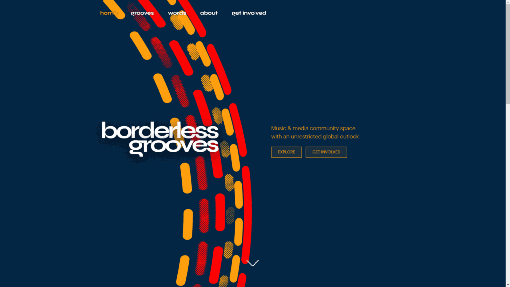
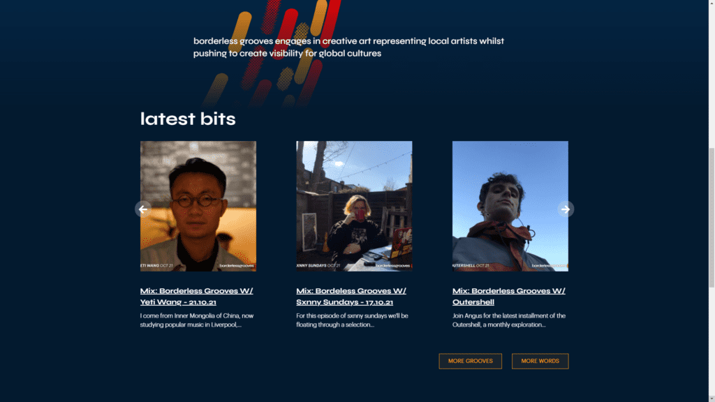
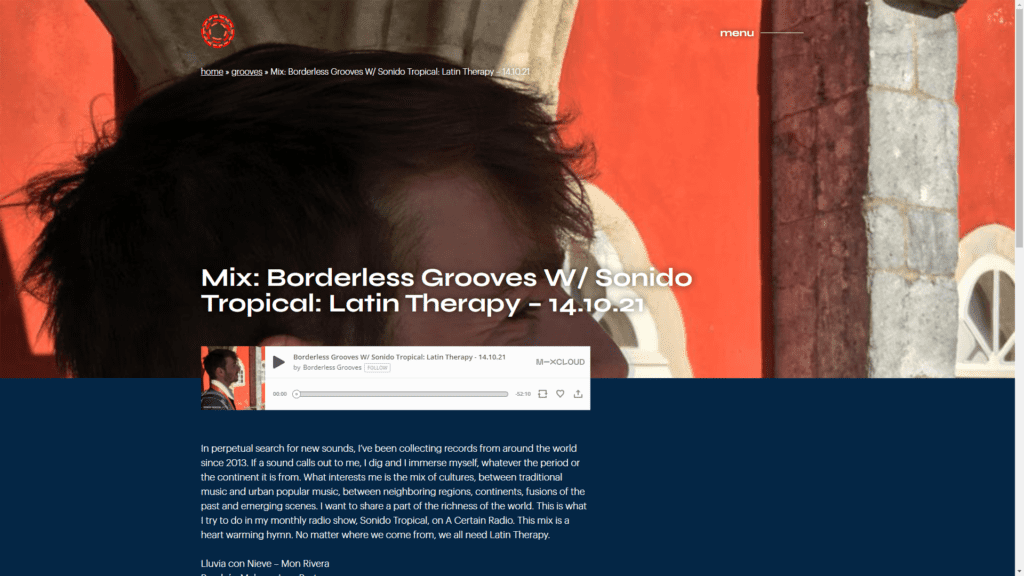
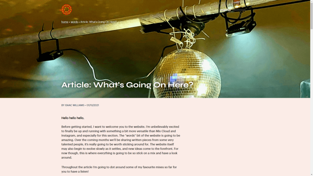
Isaac wanted a snappy, modern looking website for his new community platform. Working alongside Isaac and in-house designer Lawrence Dinh, I consulted on the logo and identity process before fleshing out the core brand elements into a full website design.
On a technical note, the site hosts over 100 images and mix entries while optimising and staying fast.


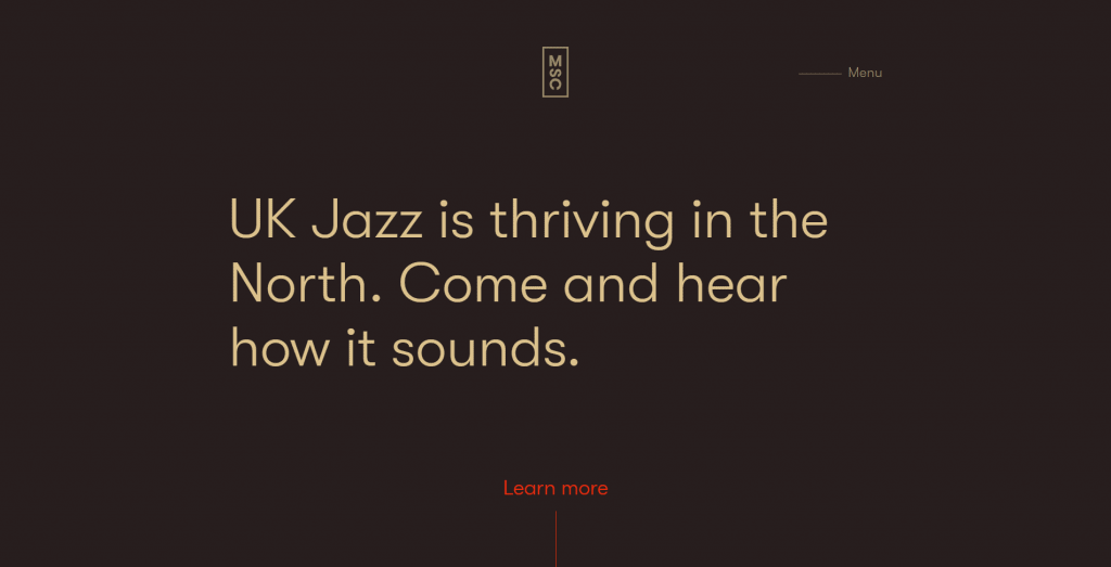
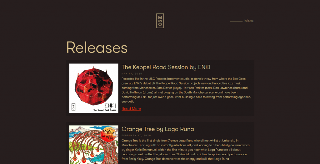
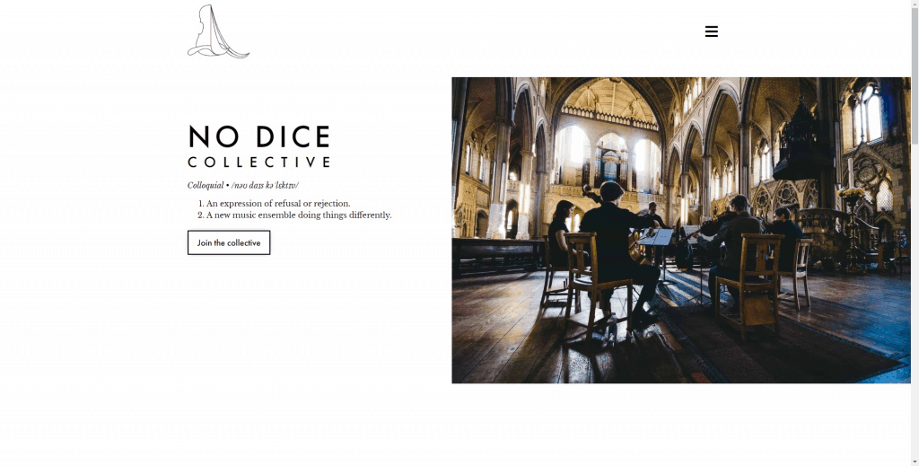
What’s the point of having a website? Who are we talking to? That’s always my starting point when taking on a project, and Josh Mellard’s record label was no different.
People usually discover artists, not labels, so I focused the home page on educating viewers on the label’s ethos and musical focus to get them on side before visiting other artists and discovering more musical talent.
Everything packed into your website
- 1-1 discovery session to talk through existing branding and (super important) what purpose your website serves
- Design mock-up for your approval before the build
- WordPress website with alterations for tablet and mobile to ensure complete compatibility
- SEO best practice baked in to ensure Google is reading your site correctly and listing you highly
- Every image resized and compressed for fastest load time
- Litespeed cache to shave further seconds off your load time
- Proper email setup for your contact page with full authentication to ensure you never miss a contact page enquiry
- WordPress security to protect against the hackers and spammers
- Reference video on how to use the whole site so you’re independent and in control
Ready to get serious about your online presence?
Hugh had been meaning to make a website for years.
He saw I’d just finished my own website and reached out.
4 days later he had a beautiful new website to show prospective employers!
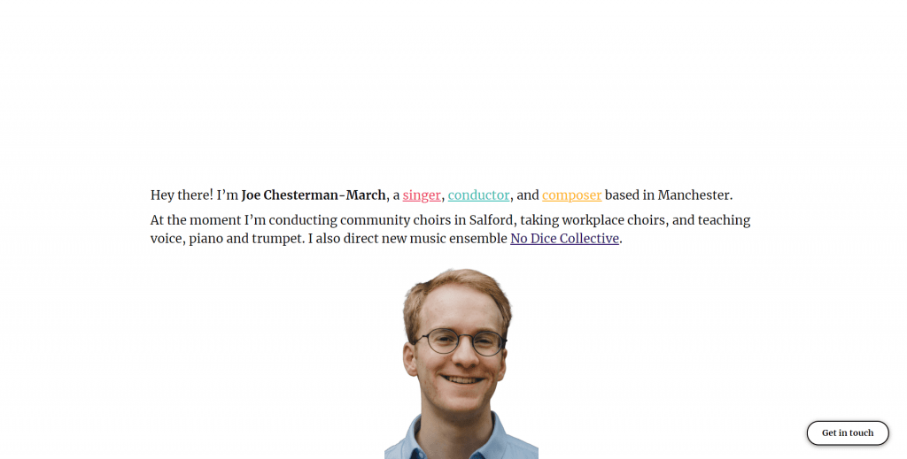
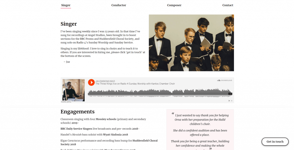
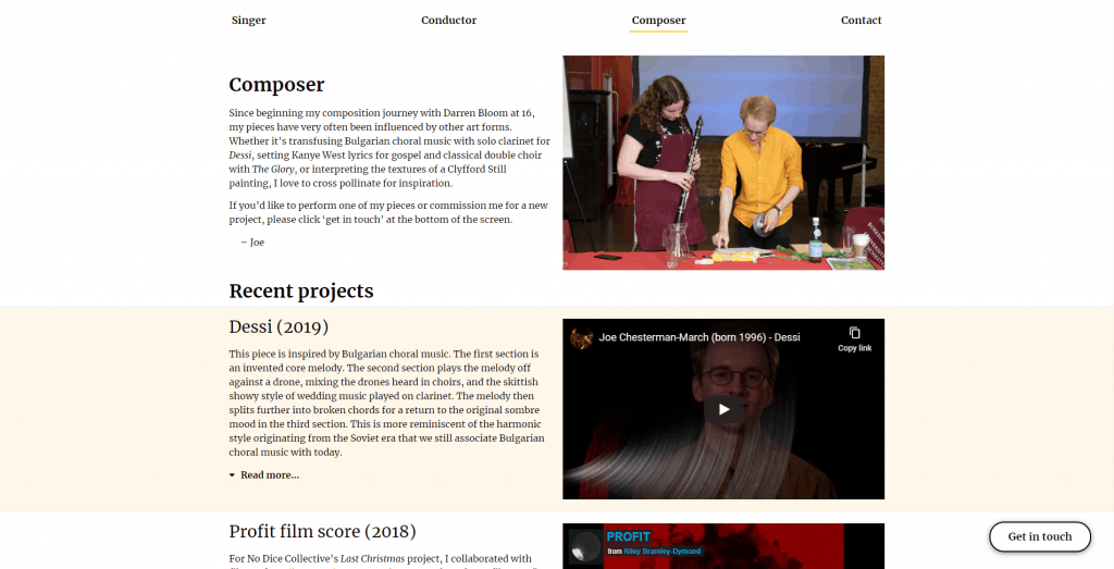
How do you condense down singing, trumpet, piano, teaching in all those fields, composing, composing workshops, studio work, personal studio pieces, choral conducting, new music instrumental conducting into one website?
Not an easy task. If you’ve got a lot of strands to your portfolio, I can help you group and prioritise your skills without missing anything out.
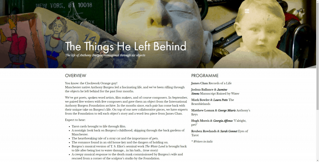
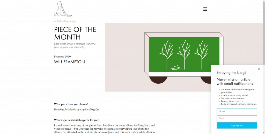
This is a big website. We’ve got
- Events listings
- Blog
- Pop-up email sign-ups
- Podcast
- Fully featured listen page
- In-line email sign-ups
This website really has the works. If you need a rich, central hub for your organisation, let’s chat.
Seen enough?
